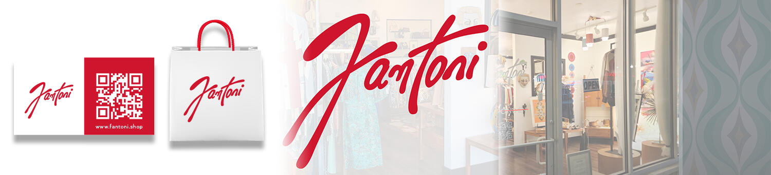
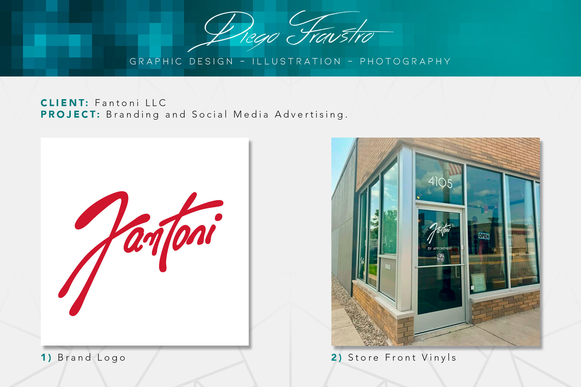
Fantoni LLC: Branding Design
In December 2023, my partner and I decided to bring our vision of a vintage clothing store to life. Fantoni would be more than just a store; it would blend vintage fashion with art, design literature, and home decor. Inspired by the iconic pottery artist Marcello Fantoni, my partner chose the name as a tribute to his timeless artistry. This venture gave me the exciting opportunity to explore a type of branding I’d never tackled before, one that was less corporate and more artistic. The creative direction was clear: embrace a sophisticated "Mid-Century Modern" aesthetic that mirrored the store's curated style; elegant, dressy, and far removed from the casual streetwear vibe.The obvious first step was creating the logo, and the concept behind it was clear from the start. It would emulate the look of a signature, similar to those often found at the bottom of pottery pieces. To ensure it felt unique and personal, no typography was used. Instead, the logo was hand-drawn on paper and then digitally traced.For the color palette, we chose a bold shade of red as the official color to make a statement. Red is a striking, emotionally resonant color that symbolizes strength, love, and vitality.Once the branding foundation was in place, we ordered custom vinyl cutouts for the facade of the store. To maintain a sense of elegance and create a striking contrast, we opted for white vinyl for the storefront signage.
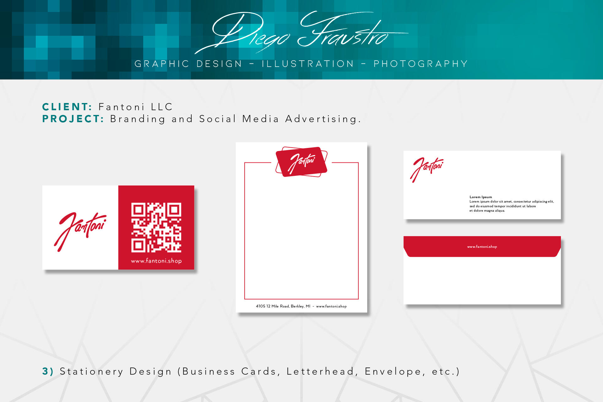
With the foundation in place, the rest of the branding design started to fall into place more easily. The next step was to focus on the stationery, which I broke down into three main elements: business card, letterhead, and envelope. For the business card, I opted for a minimalistic approach, as I felt the logo was bold enough to make a statement on its own. To keep things modern and accessible, I added a QR code, allowing customers to easily access our online presence. The envelope followed a similar minimalist style to the business card, maintaining a sense of elegance and simplicity. However, for the letterhead, I decided to take a more creative approach, as the minimalist style was starting to lean too heavily into a corporate aesthetic, which I wanted to avoid from the start.
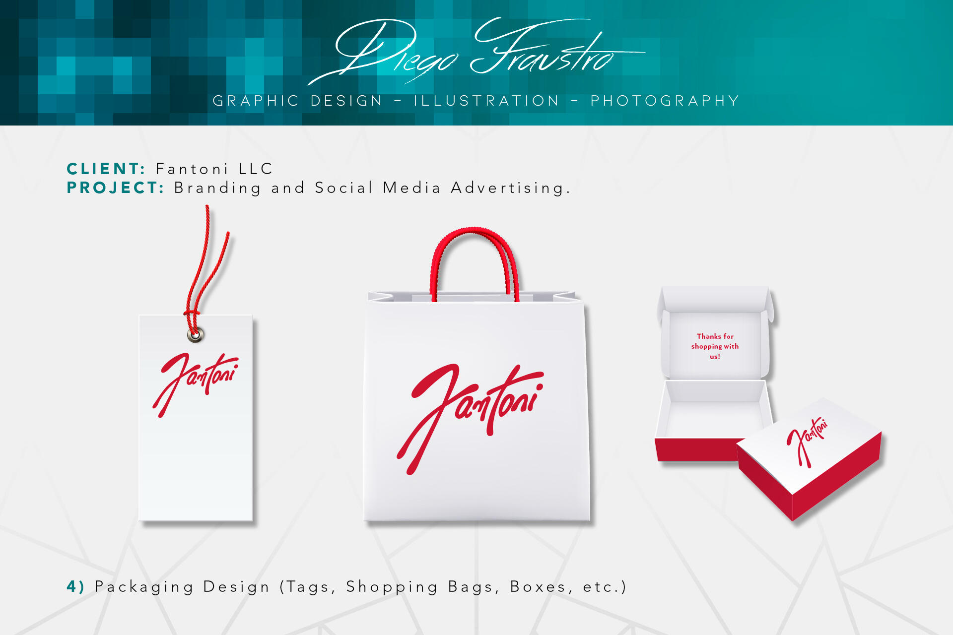
A store's branding wouldn't be complete without its accompanying packaging design, which was also divided into three key elements: price tags, shopping bags, and boxes. These elements follow the same aesthetic as the stationery design, maintaining consistency throughout and reinforcing the brand's identity.
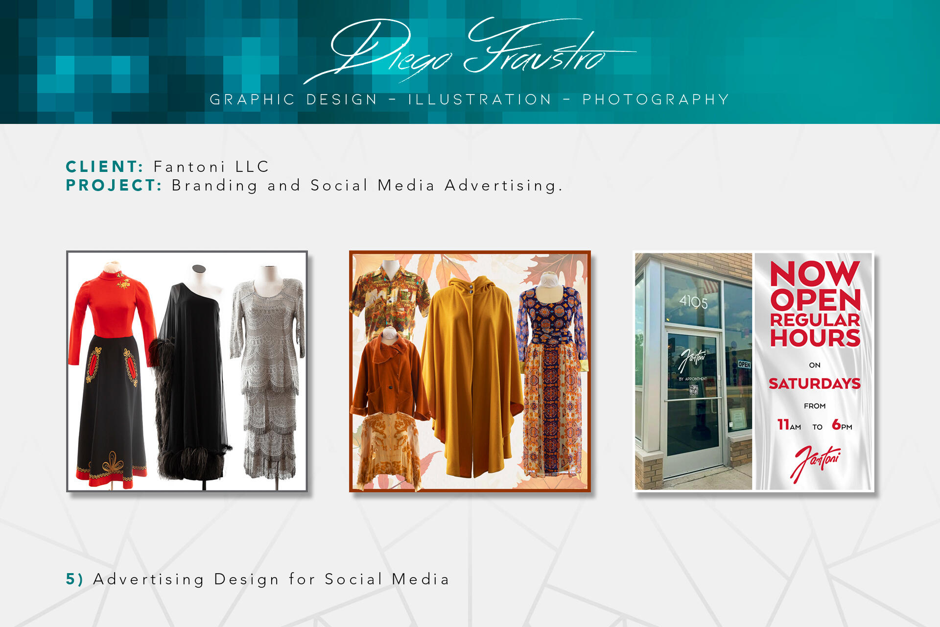
For Fantoni’s social media, I created posts that capture the store’s vintage vibe while keeping things fresh and stylish. From ads and flyers to product collages and infographics, everything stays true to the brand. These designs help connect with our audience and make the online experience feel as special as shopping in the store.
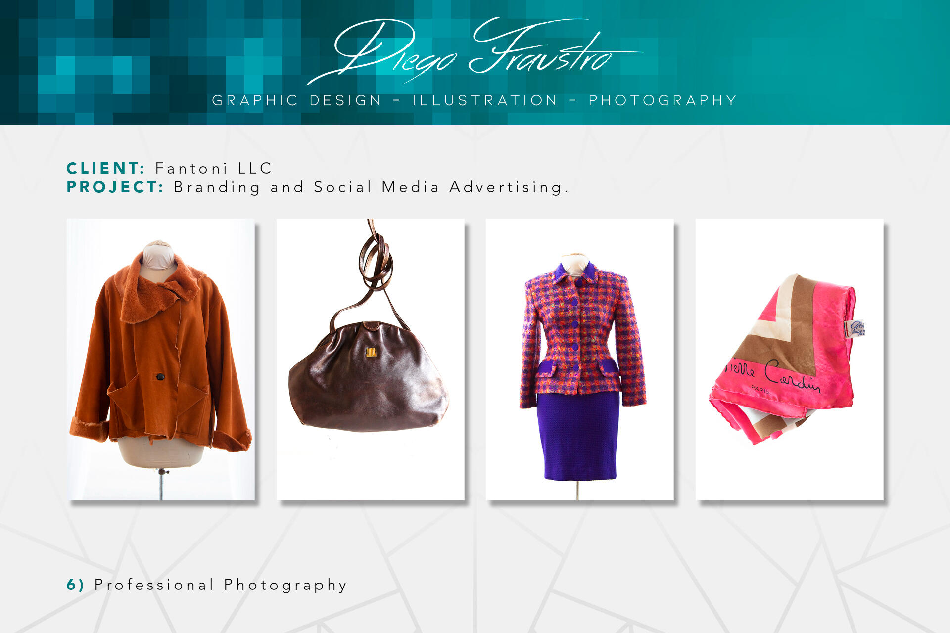
For Fantoni’s product photography, I focused on capturing the essence of each item with a clean, artistic touch. The goal was to showcase the beauty and details of our vintage pieces in a way that feels both timeless and inviting.
While we haven't received formal feedback on the branding design itself, we've had plenty of praise for the store overall. Customers have complimented the curated inventory, the ease of exploring the space, and the overall vibe. We've managed to maintain an average of five stars on Google reviews.The branding design has certainly helped with recognition, as ours is the only store in the area with a signature-style logo. Since opening, the store's sales have been steadily growing month after month. The more I reflect on it, the more I realize that the decisions we made were the right ones.